Devlog – Updated UI preview and Deeds Update teaser
Greetings Viceroys!
A wise man once said:
In the THIRTEENTH Early Access Update, we undertake an enormous effort to prove that number 13 is not as bad as it seems. We also tackle a similarly broad endeavor of creating an entirely new, modern UI.
Talk about things that didn’t age well, huh?
That wise man was me and I regret no one’s ever going to quote me anymore. But although we didn’t manage to lift the curse of the number 13, we continue to put a lot of effort into improving the UI. And today, we want to share some previews with you.
UPDATED INTERFACE PREVIEW
We thoroughly read all your feedback and tried to distill what you liked about the previous UI. Based on those findings, we started applying changes to the new interface. Here are some previews:
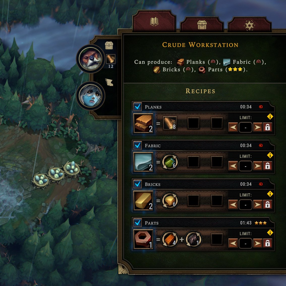
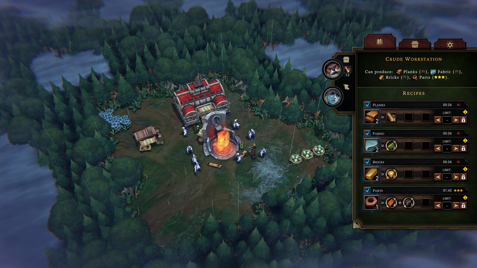
Workshop Panel preview with 4 Recipes (Parts were added for the visualization purposes).
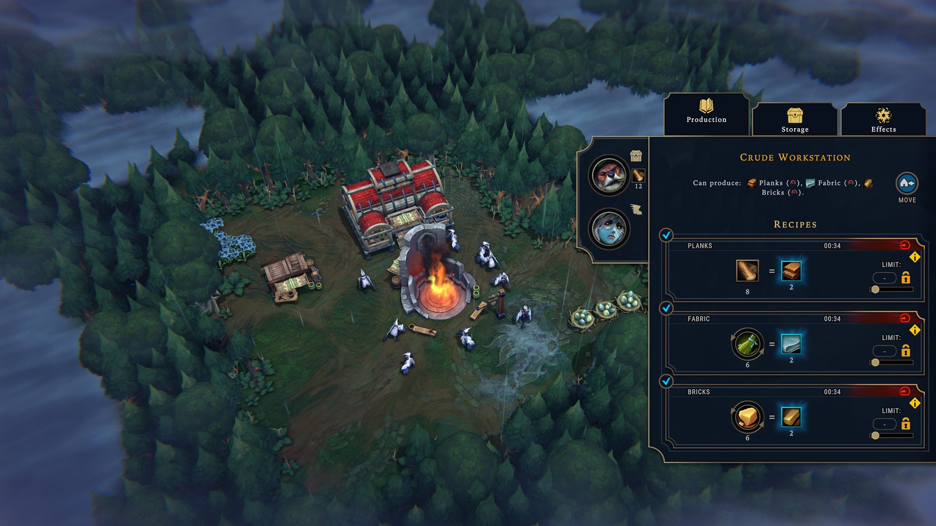
Workshop Panel comparison (please note that the updated version contains 4 Recipes).
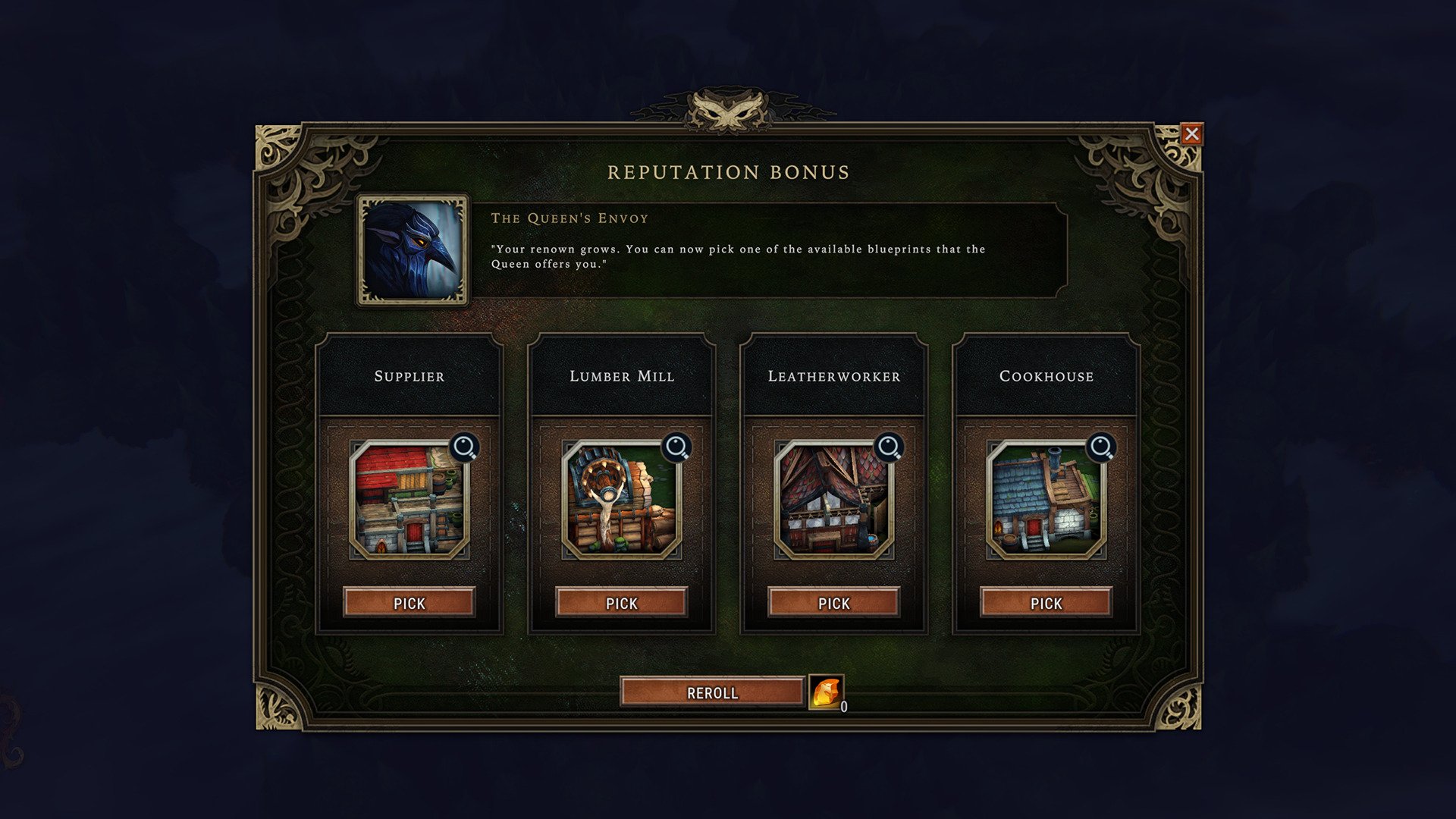
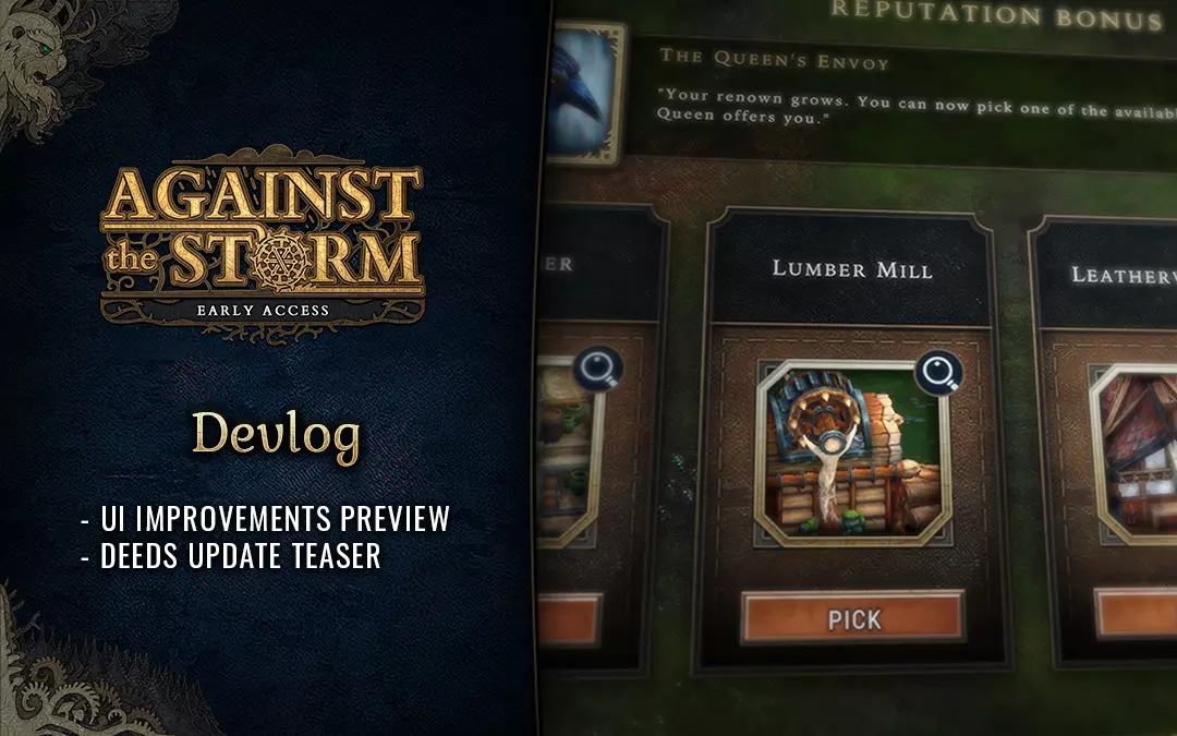
Reputation Bonus window.
We decided to tend to the newly introduced shapes and general style, but we’re making significant changes to multiple elements:
- Window and panel backgrounds will receive an earthy green texture and new leatherwork decorations.
- Window frames will be widened and more decorated.
- The workshop window will be narrowed.
- The workshop window’s workers panel will be narrowed.
- The worker slot selection radial menu will receive new decorations.
- DIfferent elements of building windows will be better differentiated.
- Various windows will receive new decorations.
- Some vibrant colors will be toned down.
- The building icons will be zoomed out so that their shape fits the frame.
- The recipe order may change (read more below).
- And more!
We will reveal more previews in the near future after we get some early feedback.
Recipes Panel
We consider changing the order of the Recipe formulas in workshops. The good that you want to create would be moved to the left and aligned vertically with icons of other recipes to help you quickly scan through available recipes and only then get into the detail of changing ingredients.
Then again, we all got used to the previous version, so we would love to hear what you think about it.
INTERFACE UPDATE FAQ
The Interface Update was one of the most discussed updates so far and at times we weren’t able to respond to every message we received. So here are the answers to some most common questions:
Why have you decided to change the UI?
The previous UI was a patchwork of various ideas and styles we developed over the years and became more and more inconsistent and troublesome with every update. We kept receiving feedback about readability issues and we were able to spot usability problems that new players were facing. On top of that, we knew we have to significantly reorganize it in the backend. This led us to a decision of reworking the entire UI and addressing the causes of issues instead of just putting an additional layer of patches on the burdened interface.
Reworking the interface is a step towards:
- Improving readability.
- Unifying inconsistent elements.
- Building solid foundations for new upcoming interface elements.
- Optimizing it.
Cleaning up the UI from heavy ornaments was one of the principles we agreed on. We now know that the ‘handcrafted’, warm feeling is what you miss the most from the previous UI.
With the changes that we apply to the new UI, we want to meet you halfway. We want to achieve the goals we’ve set without sacrificing the unique look of the UI which differentiates Against the Storm from other modern city builders.
Can you revert the UI to the previous one?
As explained in the previous answer, the change was necessary. Changing it back to the previous version would only postpone the inevitable. And since we’re still in Early Access, we want to make the best out of your feedback and use it to perfect the new version.
Can we switch between one interface and another?
Unfortunately, this means double the work for the team which would significantly slow us down when it comes to adding new features. This is a cost we can’t really pay. We’ll try to make the best out of the two and hope you’ll help us make it memorable and usable.
When will the changes from preview screenshots become available for everyone?
We’re doing our best to ship the changes as soon as possible but it’s hard to tell when they will become available. First, we want to discover your impressions. We also want to apply the changes at once to as many elements as possible to avoid having a blend of different styles which we wanted to get rid of in the first place. We estimate that the changes will appear in the next update or the one after that.
And speaking of the next update, we prepared a short preview for you.
DEEDS UPDATE PREVIEW
In the upcoming Deeds Update, we slightly change the way the Deeds work and introduce around 60 news deeds. Here are some of the new ones:
- No Loot Boxes – Win a game without opening any Caches found in Glades.
- Traveling Light – Win a game without taking any Embark Bonuses.
- Higher Needs – Ensure all villagers simultaneously have every need fulfilled from the category: Services.
The Deeds Update will be available this Thursday (April 28). Keep your eyes open for announcements. You can follow us on social media and support us by liking and sharing our news:
CALL FOR FEEDBACK
Please let us know what you think about the upcoming changes! Understanding if we’re going in the right direction will help us move the work forward. Join us on Discord and share your thoughts!
May the storm be gentle on you,
Luke & Eremite Games
CONTINUE READING...
Experimental Update – Tackling Fuelxodia
Greetings Viceroys! Sacrificing goods in the Ancient Hearth was always one of the most important tools at the Viceroy’s disposal. It is a perfect...
Against the Storm coming to gamescom 2022!
Viceroys! We're coming to gamescom 2022! We'll be in Hall 10.2 at F-011G booth together with Hooded Horse ready to welcome you and chat about...
Quality of Life 3 Update available!
Greetings Viceroys! It’s new-update o’clock already, so without further ado, here’s what we prepared for you: Wildcards Increased game duration...

