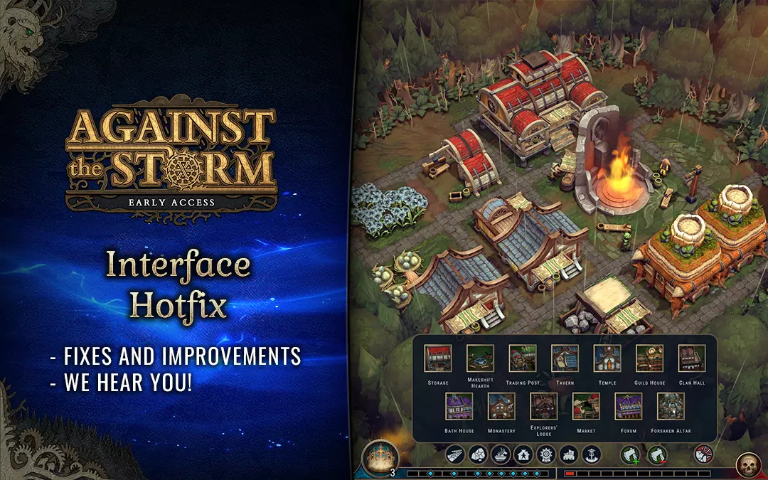
Interface Hotfix – We hear you!
Greetings Viceroys!
Let me start by saying: We hear you!
Yesterday’s UI changes met with mixed responses. And that’s totally understandable. We introduced a whole new idea to the game’s fundamental element. We changed things that we all got accustomed to.
This UI overhaul is just the first step in a long journey. With your help and feedback, we will continue to improve the UI over the course of the next updates. While this might be a little tough to reflect on now, the previous UI had its growing baggage of issues. We now know better what you valued in it, so we will put a lot of effort to meet your expectations and our requirements.
We’ll address the readability feedback in the first instance. The ability to conveniently control the game is our top priority. Some of the most pressing issues were already addressed in this hotfix (read the full list of changes below).
We’ll continue to read and analyze your feedback. You make very good points and we plan to address them. Here are the things you can expect to be changed in the near future:
- Changes to the HUD (especially the frames and backgrounds near the calendar, Forest Mysteries, and goods categories).
- Tweaks to the colors and backgrounds.
- Changes to the spacing in all panels.
- Changes to the icons for Citadel Resources, Reputation, and Impatience.
- Improvements to the overall feel and ornamental design of the UI.
- And more.
This list is by no means final. New challenges will arise every time we’ll introduce new features.
When it comes to the overall style and visuals of the new UI – as you correctly noted, it’s more minimalistic and toned down when compared to the previous one. We understand that the older version was very unique and appealing in its own way, especially with all the ornaments and elaborate frames around different panels. However, we feel that the best way forward is to strip it down a bit and improve from there (both in terms of style and readability). We can promise you that we will slowly add to the framework created in this update and hopefully improve it to the point where we get the best of both worlds – the readability and slickness of the new style, and the unique feel of the old UI.
CHANGELOG
- Added names to buildings in the construction menu. The menu is now a bit wider and has more space between elements.
- Added a text box in the “limit” section of recipes.
- Increased the size of checkboxes in Orders and Recipes.
- Added a highlight to the selected time speed button.
- Moved the animated background effect in the Cornerstone selection panel higher. It’s now behind the icon, not the text.
- Increased the size of Forest Mystery icons.
- Added season indicators to Forest Mystery icons on the HUD.
- Added a grayed-out overlay to inactive Forest Mysteries.
- Changed the background colors for Orders in the Order Pick Menu.
- Decreased the size of the Building and Cornerstone Pick Screen.
- Changed the Reputation icon in Orders.
- Changed the recipes in the Greenhouse and Clay Pit. They all now require 5 Sparkdew instead of 10.
- Fixed a bug with the Cornerstone slots in the Trade Post panel disappearing after buying a perk.
- Fixed a bug that caused Species Bonuses to not be displayed on the worker overlay ([ALT]).
Thank you for your detailed reports and suggestions. We appreciate respectful and constructive criticism. After all, our goal is the same. We all want to make Against the Storm as awesome as possible.
We once again wish you a happy and peaceful Easter. Enjoy the days off and take the time to relax. No egg-scuses.
May the storm be gentle on you (and us!),
Luke & Eremite Games
CONTINUE READING...
Experimental Update 3 – try out the upcoming changes!
Dear Viceroys! In this Experimental Update (Early Access v0.16.7E) we want to address your feedback regarding both the Resolve system and the...
Recipes Cookbook Update out now!
Dear Viceroys! The 7th bi-weekly Update is now live. This time, we're introducing: Recipes Summary window New Forest Mysteries And more! If you like...
‘The Blightstorm’ Fanfic by Seraphoenix
Our fantastic community surprised us once again! Seraphoenix created a page-turner fanfic for 'Against the Storm' titled 'The Blighstorm'. We love...


